
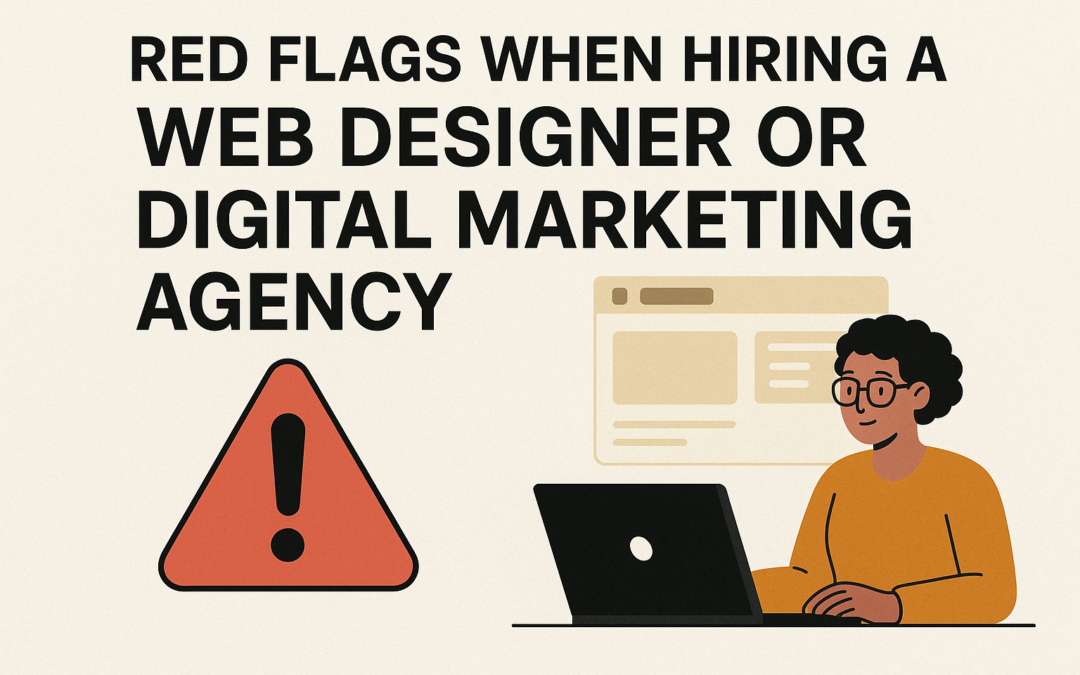
Red Flags When Hiring a Web Designer or Digital Marketing Agency (Part 2)
In Part 1, we covered six critical warning signs to watch for when choosing an agency. Now let’s explore the remaining red flags that can help you avoid costly mistakes. 7. No Portfolio or Case Studies Every legitimate agency has completed projects they’re...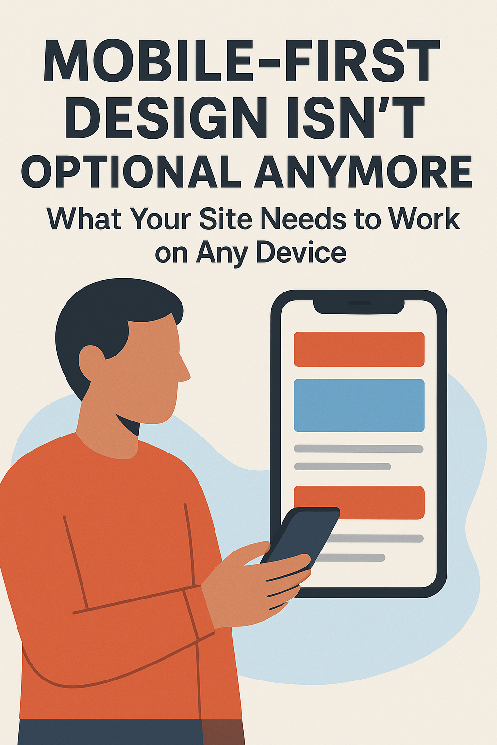
Mobile-First Design Isn’t Optional Anymore: What Your Site Needs to Work on Any Device
Over 60% of web traffic now comes from mobile devices, making mobile-first design essential for every business website. A mobile-first approach ensures your site loads fast, looks great on any screen, and delivers a seamless experience that keeps visitors engaged and improves your Google rankings.

How AI Virtual Influencers Can Transform Your Brand’s Digital Presence
In today’s fragmented digital landscape, maintaining consistent brand engagement across platforms while managing costs remains a persistent challenge. AI virtual influencers represent an emerging solution that established businesses and organizations are...How to Add Your Logo to your YouTube Videos
If you’ve ever wondered how to get your logo on all of your videos in YouTube, this quick tutorial video is for you. We had a few people ask us how to add their logo at the bottom right of their videos on YouTube and we thought creating a quick video would be...Attn Orlando: Upcoming Facebook Training
This post is part of our Reluctant Social Media Manager series, support for those of us who want measurable social media results with the least amount of effort. This year has been full of excitement for Design Theory, and this summer is no exception. Earlier this...-
 CAPABILITY STATEMENT$150.00
![]()
Sign up now, and create a free account with MailChimp and start sending better emails with tracking, social media, preset and customized templates.