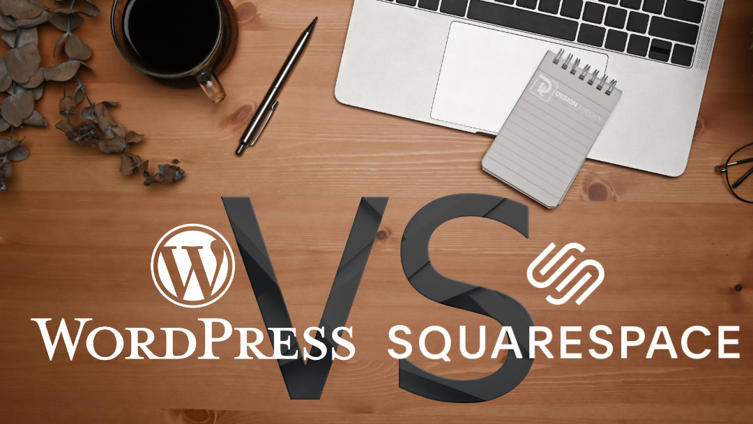
Cost Comparison: WordPress vs. Squarespace
Most new business professionals and entrepreneurs are bootstrapping when they’re starting their new venture. Hiring a staff or agency isn’t always financially possible, and so they’ll try and learn and do as much as they can to get their business to a viable start with a limited budget. When it comes to the cost of building and maintaining a website, business professionals need to consider more than just the initial price of investment, they’ll also need to consider the quality (and functional features) and the amount of time it will take to launch. While WordPress and Squarespace have different pricing structures, there are hidden costs associated with both platforms, from time investment to ongoing maintenance.
Let’s break down the costs involved in building and running a website on each platform, so you can make an informed decision about where to invest your time and money.
WordPress: A Customizable, Pay-As-You-Go Approach
With WordPress, the cost can range widely depending on your needs and how much customization you require.
Cost Breakdown for WordPress:
1.Domain Name:
Typically you can purchase your domain for an annual cost of $10 to $20 per year. You can purchase your domain from a variety of providers, such as GoDaddy or IONOS (Formally 1and1).
2.Hosting:
WordPress doesn’t include hosting, so you’ll need to factor that in. Shared hosting plans start at around $3 to $10 per month, but if you need better performance, expect to pay for managed WordPress hosting, which can range from $20 to $100+ per month for higher traffic or resource-heavy websites. We recommend SiteGround for their great customer support, server performance, and pricing tiers.
3.Themes and Plugins:
While there are free themes and plugins available, many businesses go for premium options to achieve a more professional look and enhanced functionality. Premium themes range from $30 to $100 that may be one time or have an annual license that includes regular updates. Plugins can cost anywhere from $5 to $200+ per year depending on the functionality you need.
4.Developer Fees (Optional):
If you need custom functionality or advanced design, hiring a developer can cost anywhere from $50 to $200+ per hour. If your project requires extensive custom coding, expect a web development budget starting at $500 to several thousand dollars, depending on the complexity of your project.
5.Maintenance and Security:
Since you’re responsible for managing updates, security patches, and backups, you may want to invest in a managed service or security plugin. Budget $10 to $50 per month for these services, or more if you opt for premium backup and security solutions.
Time Investment for WordPress:
•Building the Site:
Depending on your experience, building a WordPress site from scratch can take anywhere from 20 to 100+ hours. If you’re using a pre-built theme and plugins, it will take less time, but customizations will add hours to the process. If it is your first time, prepare to spend quite a bit of time learning some technical aspects of the infrastructure setup. You’ll want to have a good idea for where you want your website to be and look initially and what growing it with additional features and functions will entail.
•Maintenance:
WordPress requires regular updates, both for the platform itself and for plugins and themes. Budget a few hours per month for this, or pay for a managed service if you want to offload the responsibility. You’ll also need to periodically monitor performance, security, and backups. Many of these tasks can be automated, and that will save you a lot of time. You can also hire an agency to monitor and maintain your website and perform the necessary updates and backups for you so that you can toss that hat away.
Squarespace: All-Inclusive with Transparent Pricing
Squarespace offers an all-in-one solution with pricing that covers hosting, design templates, and even e-commerce features if needed. While the price is more straightforward, you may end up paying more for features that come standard in WordPress via free plugins.
Cost Breakdown for Squarespace:
1.Domain Name:
Squarespace offers a free domain for the first year when you sign up for an annual plan. After that, the domain renewal costs about $20 to $40 per year.
2.Monthly Subscription:
Squarespace’s pricing is subscription-based. Plans range from $16 to $65 per month, depending on whether you need basic website functionality or more advanced e-commerce features.
- Personal Plan: $16/month – Basic website with a few pages and no e-commerce functionality.
- Business Plan: $23/month – Adds e-commerce and marketing tools.
- Basic Commerce: $27/month – Ideal for businesses selling products online.
- Advanced Commerce: $49/month – Includes advanced e-commerce features, such as abandoned cart recovery and subscriptions.
3.Design Templates and Features:
Squarespace includes a selection of high-quality, responsive templates at no additional cost. There are no additional fees for themes or templates, unlike WordPress, where premium themes are often necessary for a more polished look.
4.Additional Costs:
Squarespace’s integrated tools may reduce the need for third-party services, but some features (like advanced marketing integrations) could still require additional investment, such as paying for email marketing services or external plugins.
Time Investment for Squarespace:
•Building the Site:
Squarespace is designed for users with little to no coding experience. You can build a simple site in 5 to 20 hours, depending on how much customization and content you need to add. Most of the process involves selecting a template and adjusting it to fit your brand.
•Maintenance:
Squarespace takes care of updates, security, and backups for you. This significantly reduces the time you’ll need to spend maintaining the site. Business owners can expect to spend less than 1 hour per month on upkeep—typically updating content or adding new features.
Important Considerations for Business Professionals
1.Budget Flexibility:
If you’re operating on a tight budget, WordPress offers more flexibility. You can start with a low-cost hosting plan and add features as your business grows. Squarespace, while convenient, has fixed subscription costs that may not scale as efficiently as your site’s needs grow.
2.Time vs. Customization:
WordPress demands more time to learn, build, and maintain, but in return, you get unmatched customization and scalability. Squarespace, on the other hand, saves time with its ease of use but sacrifices flexibility. Consider how much time you can dedicate upfront and over the long term when making your decision.
3.Long-Term Growth:
If you anticipate significant growth in your business or need advanced functionality like a custom-built e-commerce system, membership site, or integrations with other platforms, WordPress is a better long-term solution. Squarespace is great for small to medium-sized businesses that value simplicity but may fall short as your business scales.
4.Tech Expertise:
If you don’t have technical expertise and don’t want to hire a developer, Squarespace is the easier, lower-maintenance option. WordPress, while powerful, requires either tech knowledge or the willingness to invest in professional support.
Our Final Thoughts on Cost and Time Involvement
When choosing between WordPress and Squarespace, it boils down to balancing cost, time, and flexibility. WordPress allows you to start small and grow with your business, but the hidden costs in development, maintenance, and plugins can add up. Squarespace provides a more predictable cost structure, but if your business outgrows its capabilities, you may need to switch platforms down the line. If you’re a business professional looking for a quick, hands-off solution, Squarespace’s ease of use is hard to beat. However, if you’re in it for the long haul and envision a website that evolves as your business grows, WordPress offers the versatility to make that happen if you’re willing to put in the time.
Not every website project is the same and so we couldn’t recommend one of these to everyone. Hopefully after reading this article and seeing the different options you now have a better idea of which platform will be best for you and your business.

![Developer and Client Transparency Presentation [VIDEO]](https://jpdesigntheory.com/wp-content/uploads/2017/03/Client-Transparency-WP-Orlando-Jeans-Picture-1080x675.jpg)


