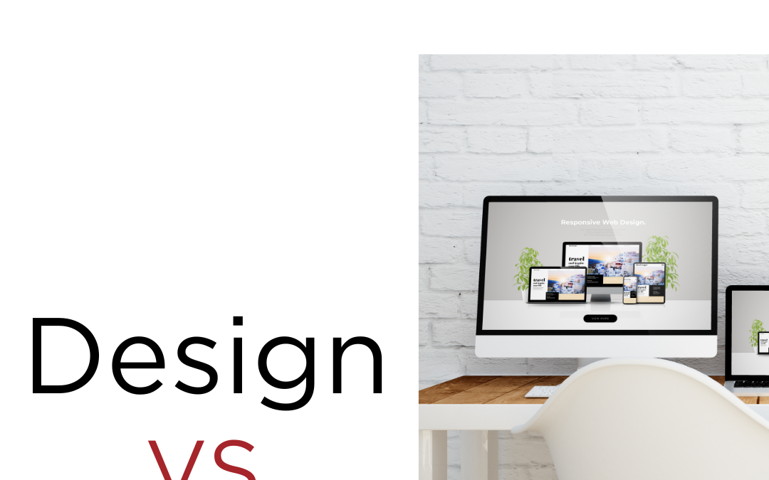
Web Design
Do you have difficulty getting visitors to come to your website?
The first thought that may go through your mind is that you’re not marketing enough, but you may be overlooking a common problem. Most people who do a search on Google.com don’t spend very much time deciding whether the website they clicked on is where they want to be. Typically, the decision to stay or go will happen within 7 seconds, which is commonly known as the 7 second rule. To ensure visitors are staying on your website after those first 7 seconds your website needs to have:
1. Easily accessible information
2. A user-friendy layout (clear and concise navigation)
3. An attractive design
Here are some examples of websites that DO NOT provide users with these three important design concepts:
Serene-Naturist.com
This website has so many design no-nos, I don’t even know where to begin! First off, all of the extra graphics, such as the butterflies, really distract you from what the website is really about. Secondly, the design does not look professional at all, giving it the impression that it was made by a 10 year old. You definitely don’t want that if you’re going to run a professional business. Also, the page loads very slowly because of the plethora of images and moving graphics that are completely unnecessary.
ChesterTourist.com
This website suffers from what I call “information overload.” The user doesn’t know where to click. There are just way too many links that are placed everywhere and not organized. This website would be a lot easier to navigate if the designer had grouped the links into categories and displayed them in one menu (e.g., a drop down menu).
Those were examples of BAD website design. Here are some examples of GOOD website design:
First Church of the Living God
This website is one of our own (created by the Design Theory team) and highlights some very good aspects of design. Unlike ChesterTourist.com, the navigation is very clear and concise. If you hover over the links on the navigation bar near the top you will see how much easier the website is to navigate with the links grouped into categories and displayed in a drop-down menu, which is what ChesterTourist.com should have done with their links. As you can see, the website is clearly about a church and the information (our services, media, events, etc.) is easily accessible and presented in an attractive, easy-to-read format.
Preston Dental Care
This is another website that we (the Design Theory team) have designed. Again, the navigation is very clear and concise, and easy-to-read. If you want to find out more about what services Preston Dental Care offers, the link for “Services” is right in front of you in large letters.
A very simple, easy-to-read layout is very important for getting more users to come to your website. I think the worst thing you can do is confuse the user. Your business may have the best product or service in the world, but if you don’t present it in a way that is easily accessible on your website, you will have a lot of trouble getting new customers.
Check out our design portfolio if you want to see more examples of GOOD designs 🙂
What about you? Have you seen any websites recently that you loved, or maybe some you wish you hadn’t seen?
All Posts, Marketing, Web Design
So you made the jump from a safe, warm, and cozy job to the freedom of freelancing. You’ve dreamt about it for so long, wondering how the sun feels during the day while you were locked away behind a fluorescent lit cubicle isles and rows from the nearest window. Well you’ve arrived; so now what? How are you going to pay your bills, grow your skills, and market your skills on a shoe-string budget? Keep reading…
One of the more important characteristics of a successful is maintaining a steady flow of work. That work may come from agencies, current, or new clients. To me, each creative will find their own way to attain their own work but below are a few tips to try:
Online Agencies: These are good because most of the risk is on them so long as you hold up your end of the bargain. If you’re great at creating logos, but really don’t like to get into haggling and negotiating prices, these places are for you. You can create a profile, list your skills, and post your rate per hour or project. Then wait for the emails to come in. You’ll want to do some market research though so that you’re not too high or too low that you price yourself out of work or respect.
Network Locally: This one may be a step out of your comfort zone. Yes we have social media now a days and we can hide behind our keyboards, smart phones, and laptops but live networking still is held in high regard. Find out when and where other business professionals are hanging out after hours; then be there with them. Bring your business cards, but don’t pass them out like free tickets. Instead try making conversation first. Ask individuals what they do and repeat it back to them along with points of view while including their name here and there to show that you are paying attention to them. Before you know it, they’ll ask you for your card and then you can tell them about how awesome you are at design and how much fun you have helping people grow their business and brand.
Sponsor a Community Event: Pro-bono may be a great way to start out especially if you’re skittish about how people may appreciate your work. It’s also great experience in dealing with customers. You’ll run into all kinds, and before long you’ll have favorites and you’ll have some you wish you never met. As a self-starter, your reputation is everything so doing a free design or website for a local church could win you a lot of “oooohhhs” and “ahhhhs” from the members who all work in the community. A few thank yous and nice words from some non-profit organizations that rub shoulders with city officials could propel you to great levels. So even though the money may not have been there, you’ll still have new material for your portfolio, highly visible clientele, and letters of recognition you can tout around like trophies.
Embrace Social Media: This one comes with a grain of salt. There are many outlets out there to use. Find two or three that you can really wrap your mind around and feel comfortable using – and use them! Post daily, post often, but keep in mind you’re looking to engage first. The selling of your skills will be evident enough in your bio. Use it to showcase new designs you created. Get people to rate or comment on your work or even offer opinions and feedback. Learn how to strike up good conversations that may provide some great insight to someone’s problem or project and that could land you a job right then and there or not long down the road since you sound like you know what you’re talking about.
Your Portfolio: Well after showing off and practicing your elevator speech, you must have a place for all these people to view your work and vet your skills. Even if you don’t want to set up a full-out 50 page website that has all types of forms, sub pages, and FAQ’s with endless breadcrumbs, you should still have an online presence. I’ve seen some really nice designer websites that were nothing more than full-width graphics stacked, scrolling, or animated with just a contact page with a phone number and 3 line form. Be versatile though with your displays so that businesses of most industries can envision you doing their work and not think you’re just a niche designer. Unless however you want to be tied to a specific industry. Nothing wrong with that. Let me also mention blogging. A great way to provide great tips on your trade that not only shows insight, but proves you are the authority on that subject matter.
Well for those of you who’ve been doing this for some time, why not offer some tips to others in the comments below.
Web Design, Web Development
According to a study put out a few years back, 46% of small businesses do not have a website. While I’m sure this number has changed, there are still a number of businesses without a current website–or one at all. The following is a look at some of the reasons why a website is becoming more and more vital in the current economy.
Get Found: A good deal of searches for local businesses are now taking place from mobile phones. These are people who are literally on their way to you–if they can find out if you meet their needs. Having a good (and current!) site may be the difference between them choosing you or the business down the street.
Always There: If a potential customer has a question outside of your business hours, how will they get an answer? A website doesn’t shut off when business hours end, and so can be a way for people to get answers at 2am.
Credibility: In addition to marketing your business, having a website can build your credibility. It gives you a chance to perhaps address some questions in an FAQ or display your affiliations. In addition, blogging can be another great way to brand yourself as an expert and improve your Search Engine Optimization in one fell swoop.
Cost: Doing some research into advertising rates in my area, I found that a traditional newspaper ad, run for a week, costs around $500. If a small business were to advertise continually there, it would run them about $26,000 annually. A small business website generally costs significantly less than that. Also, traditional media might not have the desired visibility and is more likely to miss potential customers–they don’t pick up a paper that day and they don’t find you.
Competition: What happens when your competitor has a website and you don’t? People, in general, are more likely to trust (and purchase) from a well-designed current site. If that’s not your company, then you could be missing some revenue (and who doesn’t want more of that?)
These are just a few reasons why having a website is so vital. If you are the part of the 46%, please consider contacting jp Design Theory today to bring your business into the digital age.
All Posts, Marketing, Web Design
The term “auto response” sometimes get a little per-judging. We’ve all been there; getting bot-like email replies when trying to contact a company for assistance, or trying to reach a customer service department that seems to purposely made their call prompts all lead you to a disconnection. Well that’s not what I’m here to talk about today. I’m going to briefly describe some tactics you can use today with your contact forms and email accounts that are on your website.
Just about every website out there has a contact page. On those contact pages there is usually a web form for you to fill out to have that business or person contact you back. Some ask you for your name, email, and phone number; while others may ask you many more details to get a better understanding of who you are and how they can best help you upon reply. However you capture the information one thing is clear, the person filling out the form WANTS to be contacted back.
A Healthy Way to Use Your “Contact Us” form:
Using your contact us form for more than just that generic message “Thank you for contacting Acme Corp. A representative will be contacting you within 24 hours.” I stopped shy of adding an emoticon smiley face. Well what if that auto-response said something more like: “Thanks for contacting us at Acme Corp! While you’re waiting to hear back from us, why not check out our FAQ section that we update on a weekly basis based on our client calls. And if you have a minute, Like us on Facebook.”
Not only do I probably cut my troubleshooting call backs down to half, but I also gave them a direct link to my Facebook page and suggested they Like it too. Chances are they filled out the form because they had a question about something. If I or my marketing team is doing their homework, they can track how many calls we are receiving and what types of calls come in most. Place those questions and answers back on the website and give them a link in case they missed it is great for catching those that fall through the cracks.
A Call to Action That Works All by Itself
So you’ve finally placed a great call to action on your home page or landing pages. That’s awesome! While you’re tracking how many people are filling it out, you’re also finding out some demographics right? Lets say your offering a free copy of your eBook that normally sells on Amazon for 9.95. When they fill out that CTA, they’re taken to a sub page of your website with links to download that eBook. While they’re downloading they also get an email thanking them for downloading your eBook, but also invites them to sign up for your upcoming webinar or an “exclusive” link that gives them access some charts or data that most are not privy to.
Use a Different Response for Different Forms & Emails
One of the lazier things I’ve noticed is having one email address and auto response across your whole website. I know it sounds a little harsh, but think of it this way, why mix up all those responses into one funnel. If you have multiple landing pages for different products and services, I suggest use a separate auto response with custom messages for each product or service form and email. The clients and visitors of your website will think much more highly of you if they contact you either on accident or on purpose and notice a completely different message each time for each separate product. And while we’re at it, update those messages monthly. It doesn’t take but a few minutes each one.
Subject Lines Need to Be Clever
Using generic subject lines could land your auto response email into your visitors spam folder. We all know most people don’t eve check their spam folders that often because they’re use to getting so much. Play around with a few ways to contact back with different subject lines to increase your click-through and open rate. Spark curiosity when they read your subject line so that they actually do read it and feel happy they did at the end. Maybe offer a cool deal or discount.
So what do you do with your email auto responses? Have some more ideas to add to this list? Let us know in the comments below.
All Posts, Web Design
“Hey remember me? We haven’t talked in months. Domain Tools says I haven’t been updated in 7 months. People are visiting me and apparently my content isn’t as relevant as it was when I was first built.” Well I could go on about what most websites scream when visiting them. From the ones with missing or incomplete addresses, web forms that error when you hit the submit button, to the prices that are out of date or don’t match what was quoted on the phone or in the store, misspellings and grammatical errors. If I’m hitting a soft spot, don’t feel too bad, it’s quite common.
One of the main things I stress to our clients at Design Theory, is that your website should never lay stagnant. We should be updating it regularly with fresh content. If you have a promotion going on, it should be on your website in a predominant way to attract your visitor’s attention. If you lowered or raised the prices for your products, that information needs to updated immediately or else you could cause some trouble. You have a professional website, don’t make it look cheap with misspellings and small errors. You could be losing valuable business. Web forms are the silent killers too because unless you go in and check regularly, you may not know that it isn’t working properly.
So in the spirit of love, we compiled a list of resources for you to use with your website for FREE!
Vector Icons: Icons can dramatically improve some graphic elements on your website. Especially when you don’t have the budget for a graphic designer to create a bunch of small graphics for you.
Facebook and Twitter Plug-ins: If your website isn’t “social” it needs to be ASAP.
Analytics: If you don’t know how many people are visiting your website, which pages are most popular for their content, your bounce rate, and referral links, I’m here to tell you to put some love into your site tonight and check out Google Analytics.
Call to Action: Normally you’d find a good call to action on a strategically typed and keyword-filled landing page, but you can also have these on your website’s home page. However you use them, use them. Encourage your visitors to give you their contact information in exchange for something of use to them.
Have any other Website Valentine’s Date night items you can “talk” about with your website? Share them in the comments field below.
Graphic Design, Web Design
Ok we’re calling out for those funny times of your design careers that something may have come up, a situation, a mistake, anything that you’d like to confess. Could be anonymous if you like. Please send all of your stories (quick or long) to confess@jpdesigntheory.com
Confession booth design by Arik Levy