5 Clean Website Designs for Inspiration
Clean (clutter-free and simple) website designs are very popular and give your website a very professional look. Here are 5 examples of clean designs that we hope will really inspire you. Scout Campbell Photography Created by: Mark Dobmeier (Me) Country Club Pet World...Image Optimization And Why It’s Important
Have you ever been to a website that loaded very slowly? Did that website have some images that loaded abnormally slow, even though they weren’t that large in size? The reason for that may be that the images were re-sized improperly, most likely with a WYSIWYG...What’s On Your Website Menu?
Getting creative on websites can sometimes feel constrained due to traditional layouts and verbiage, and most certainly when it comes to navigation bar and menus. Many of us think that we need to have the standard, cookie-cutter menu navigation bars that have become...Free Web Button Collection
TGIF! Time for some free stuff! Check out this collection of free web buttons, provided by Sketchdock.com. You can download the collection in .PSD format for easy editing in Adobe Photoshop. Enjoy! Download the...-
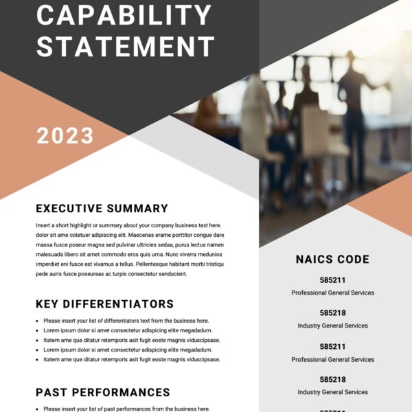 CAPABILITY STATEMENT$150.00
![]()
Sign up now, and create a free account with MailChimp and start sending better emails with tracking, social media, preset and customized templates.