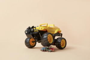
 My kids recently taught me a lesson in how they view the world I’ve put around them. Eating dinner and taking showers aren’t they’re most favorite things to do. But having “lunch” and taking bubble baths are. At first glance the two comparisons don’t seem to be much, but they actually are. It’s all in the wrapping and presentation. Much like how toys are always in bright vibrant colors, and most other products are boring and bland colored.
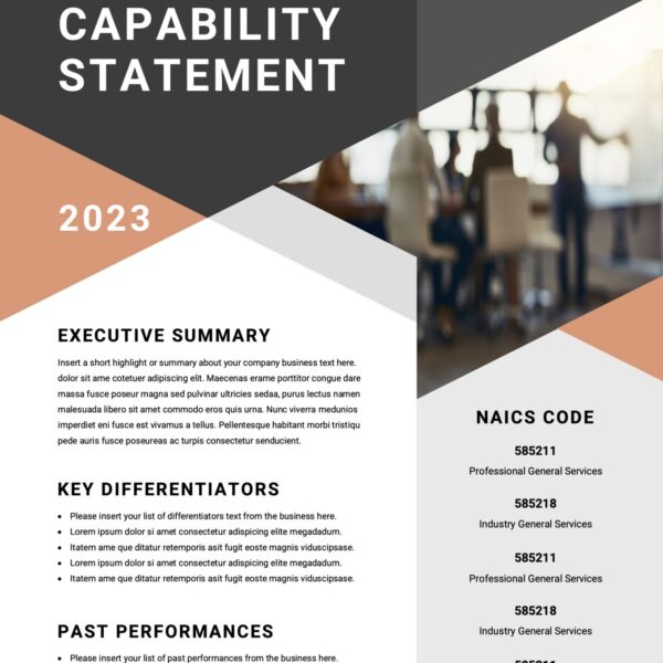
Consider your current design services. You probably have a website, tri-fold brochure, business card, and maybe a postcard flyer. What I want you to think about or review is how each of those mediums may look to your potential clients. Lets strip away all the marketing views for now, and focus purely on design and eye-candy appeal. Most consumers are impulse buyers. I’d like to separate that into two: visual impulse and conceptual impulse.
Visually your mediums should be entertaining to the eyes when they first see it. Almost telling a story about how much fun they’ll have with this new possible toy. Remember how excited you would get seeing that new commercial for a G.I. Joe action figure? You knew it didn’t move on its own, but seeing it do all those cool moves in the commercial gave you this urge that you had to have it. You visually saw yourself playing with that toy the same way.
A more aggressive approach would be to fine tune some of your mediums for the conceptual business owners. They’ll purchase mainly because they already understand a specific service or product need in their minds. Sure you may offer many design services, but they’re only interested in one. Once you can identify that, it will become your open door to offering other companion services to them.
I would suggest the same for when you setup a package specific for a new potential client. Do a little research and see if you can find out what may be eye-catching to them. If it’s through someone who may be referring you to their associate, ask questions about habits, likes, and what they favor. Use this information to almost customize your approach and re-edit your flyers and media kit to really get that “new toy” mesmerizing effect. Here are some tips:
- Less clutter – It’s easier to grab a potential client’s attention when they don’t have to use too much of their brain or eyes overlooking a lot of content. That goes from websites to business cards.
- Choose to use colors or Not – Bright colors aren’t necessarily always a good thing. Sometimes all white with one accent color could stand out more than a rainbow. However some well placed bright colors have a way of bringing back memories of long-lost toys that we loved when we were younger.
- Vectors or real Pictures – This is another either or cases here. And I’m not talking clip art. If you’re more into vectors then stay there and keep with the theme. Same if you’re using real images. But with real images you can do a lot of easy editing to have so cool effects that could create a visual for a client’s own product.
- Current Trends and Themes – When Transformers came out, big companies were falling over themselves to jump on the bandwagon and cross-promote using the Autobots and their products. If you have time, why not do the same with some of your flyers or brochures or website. It’s sure to get attention and spark conversation. The key would be to tie that in to a specific service on your part though.
Have you used this strategy before? If so I’d like to hear about it. Any other points and comments are also welcome in the fields below.


