All Posts, Apps, Graphic Design
With all the new apps coming out these days, Upscayl is one that I really felt led to write about and share with you all. Have you ever had an image that you wanted to use but couldn’t due to it’s low quality and resolution? Maybe an old photograph that was slighly out of focus and would wish you could fix it? Well Upscayl is your solution! It’s a FREE desktop app that is available for Mac, Windows, and Linux and it uses AI to process the image. They’re working on a cloud version so that you may be able to use this within your browser or mobile device without the need to install anything at all.
There’s a few settings that I thought were amazing and wanted to highlight them:
Saving an Image as PNG or JPG
There’s two buttons that you can easily select how you’d want your image to be saved as. Either PNG (Portable Network Graphic) or as JPG.

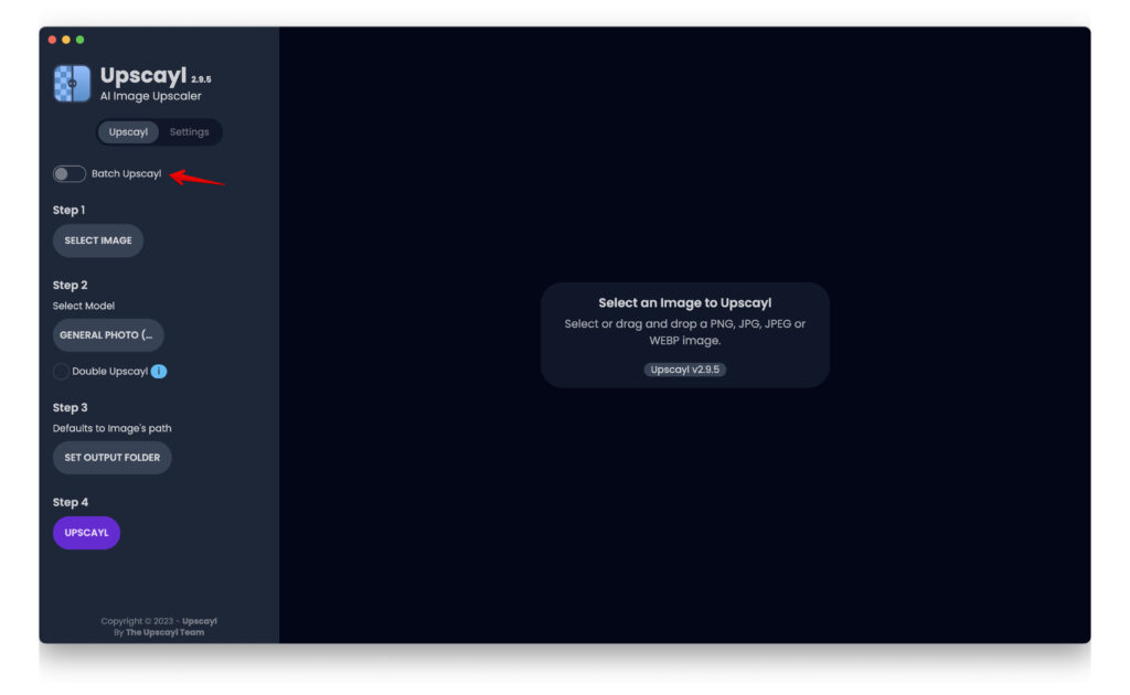
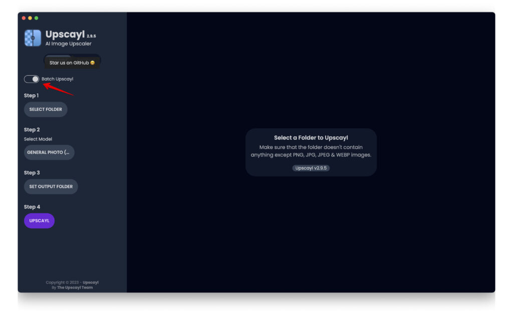
Batch Upscayl
This toggle switch enables you to select all of the images you have in a select folder to perform the same upscaling option to all of them with a single command. This is extremely useful when you may have many images that you would like to process for better quality and not have to select them one by one and wait for them to process one by one.

Hope you find this helpful and useful in your day to day tasks. Let us know how this may have helped!
All Posts, Content & Copywriting, Marketing
 The keys to persuasive, effective marketing materials are great design and informative, persuasive content. Content is both words and supporting imagery that conveys what benefits a consumer will derive from the product/service you are offering. Think of brochures as either the initial “handshake” of your business with a client or the last impression. Your business cards and brochures are essential parts of your brand and can certainly impact the marketability of your business and attracting potential clientele. This week I’d like to highlight the key components to a stand out & effective brochure.
Content can include charts, images, diagrams, listings and other graphic elements that highlight key benefits of your business services/products. Also use of calls to action can be critical to persuasion and getting the consumer to act on your solicitation. Also know that the caliber of writing of your brochure will certainly determine the effectiveness of your message and brand. If you aren’t the greatest writer, farm it out to a business or colleague that can.
 White space is an essential part of every single marketing piece, namely brochures. The lines between text and imagery are white space; which allows your readers’ eyes relax and gives them a momentary break from the content. You never want intake overload but also don’t want your content to look too sparse. White space can also be used to separate important points. For example, the brochure below is an example of too much white space & too little content.
Colors evoke feelings and emotions, and can certainly help to build a customers’ first or last impression of your business. The colors you select for your brochure design should definitely compliment or match the colors in your logo or company name. Use of vibrant colors should be done in selective areas and in moderation.
Font selection be stylistic but be easily readable and the size should be chosen based on the volume of information you are trying to convey. It should not be too large (over 14 pt.) or too small (less than 10 pt.) The font should reflect your brand style and set the tone of your organization – elegant for a bridal shop, powerful for an auto body shop. Lastly, the body copy font should differ from your headlines, but you should not exceed the use of 3 different fonts within your brochure design.
Paper selected should be reflective of the quality of your business…Yeah, I said it. Using flimsy paper or a cheap card stock may give a flimsy impression of your business. Choosing glossy or matte finish is purely subjective.
Imagery plays a critical role just like your written content. Take your time when selecting the right imagery and the placement of them. Also, do not forget to check your resolution on the images you select. The higher the resolution the better your picture will come across in print. The lower the resolution, the more blurry and unprofessional your brochure will look when printed. FYI -300 dpi or higher is best for clear, color printing.
The Design of your brochure should be simple but effective. Feel free to break away from the normal trifold and display your brand & company character. 

Among the sea of typical trifolds, how do you make your brochure stand out?
