[REVIEW] Photoshop World Orlando 2013
In April I attended the Photoshop World Expo here in Orlando, FL in April. There were so many people in attendance it was crazy. I ran into a few people I knew locally, but met a whole bunch more from all around the US. This was my first time ever attending a...Pressed Flowers Photoshop Brushes [FREE]
Our friends over at Creative Market always offer some great design stuff. Check out their site to get their free “Pressed Flowers Photoshop Brushes” absolutely free! And while you’re at it, sign up to be on their email list. That way you never miss a...Photography Friday [3.22.2013]
Before and After Edits-
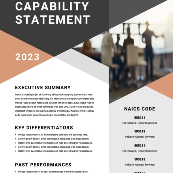 CAPABILITY STATEMENT$150.00
![]()
Sign up now, and create a free account with MailChimp and start sending better emails with tracking, social media, preset and customized templates.